When people see your shop sign, business card, or van, the font is often the first thing they notice – even if they don’t realise it. More than letters, fonts give your brand a voice and style. Whether bold and modern or classic and refined, the typeface you choose says a lot about your business. In today’s competitive world, every visual element counts, from high street signage to van graphics and exhibition displays. That’s why picking the perfect font really matters. In this blog, we’ll cover what fonts say about your brand and common mistakes to avoid in your designs.
Why Fonts Matter in Branding
Fonts may seem like a small part of branding, but they have a big impact. The right font can make your brand appear trustworthy, modern, friendly, or even luxurious. sing the wrong font might create confusion or give off the wrong impression.
In sign printing, fonts must be clear, readable, and suitable for outdoor use. They need to be legible from a distance and while moving. Unclear or unattractive fonts can weaken your brand identity.
Typography also taps into psychology—different styles evoke different emotions. Understanding these signals helps create a visual identity that reflects your values and attracts the right audience.
Fonts and What They Say About Your Brand
1. Serif Fonts – Traditional, Reliable, and Established
Serif fonts feature small strokes or “feet” at the ends of each letter. They’ve been used for hundreds of years and are often seen as formal, classic, and trustworthy.
Examples: Times New Roman, Georgia, Garamond
Ideal for:
- Law firms
- Financial institutions
- Universities
- Luxury brands
Message: “We are dependable, professional, and experienced.”
Why it works for signage: These fonts bring a sense of stability and heritage. When used in sign printing, they suggest that the business has a strong foundation. Serif fonts can work well if the spacing is generous and the font is thick enough to be readable from afar.
2. Sans-Serif Fonts – Clean, Modern, and Friendly
Sans-serif fonts are fonts without the tails. They are simple, modern, and easy to read, especially from a distance or on screens.
Examples: Arial, Helvetica, Futura, Calibri
Ideal for:
- Tech companies
- Start-ups
- Health clinics
- Retail brands
Message: “We are modern, approachable, and clear.”
Why it works for signage: These fonts are great for outdoor signs because of their clarity. If you want to appear open, friendly, and up-to-date, a sans-serif font is a safe and popular choice.
3. Script Fonts – Elegant, Creative, and Personal
Script fonts mimic handwriting and are often used to create a personal or elegant feel.
Examples: Pacifico, Great Vibes, Allura
Ideal for:
- Beauty salons
- Wedding services
- Artists
- Fashion brands
Message: “We are stylish, unique, and personal.”
Why it works for signage: Script fonts can add a touch of luxury or charm. However, they must be used carefully in sign printing, as they can be hard to read from a distance. Only use script fonts for short text like logos or taglines, not contact details or website URLs.
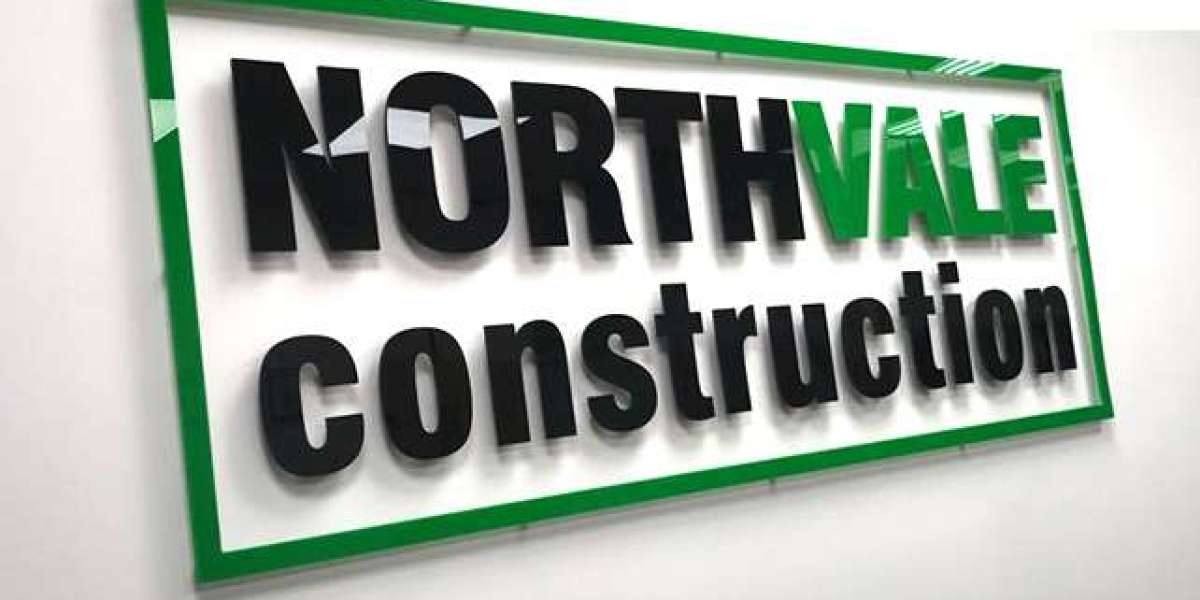
4. Display Fonts – Bold, Fun, and Attention-Grabbing
Display fonts are designed to stand out. They’re often decorative, quirky, or bold.
Examples: Impact, Lobster, Bebas Neue
Ideal for:
- Coffee shops
- Toy stores
- Event companies
- Creative studios
Message: “We are exciting, different, and full of personality.”
Why it works for signage: Display fonts are perfect for grabbing attention – ideal for shopfronts and banners. They can be eye-catching, but you must ensure they don’t become too hard to read. Stick to bold display fonts that maintain readability at speed and distance.
5. Custom or Handwritten Fonts – Unique, Artistic, and Trendy
These fonts offer a completely personalised touch. Whether it’s a font created just for your brand or one that mimics real handwriting, it helps your business stand out.
Examples: Homemade Apple, Amatic SC, custom-drawn fonts
Ideal for:
- Boutiques
- Local cafés
- Creative businesses
- Artisan brands
Message: “We are one of a kind, creative, and full of character.”
Why it works for signage: Custom fonts can make a strong visual impression and set your brand apart. But for sign printing, it’s crucial to balance style with clarity. Test it on different scales before making a final decision.
How to Match a Font to Your Brand
Choosing the right font starts with understanding your brand’s personality. Here are some simple tips:
1. Know Your Audience
What do your customers value? If you’re a law firm, they’ll expect professionalism. In a café setting, customers usually look for comfort and friendliness. Your font should match that mood.
2. Keep It Consistent
Use the same font (or a matching set of fonts) across all branding – your signs, website, and uniforms. Consistency helps build trust and brand recognition.
3. Choose for Visibility
Make sure your font is easy to read in daylight, at a distance, and in motion – especially important for sign printing. Always test your design at full size before finalising.
4. Match Font Style to Industry
As seen earlier, different industries suit different font styles. Watch what others are doing—but be bold enough to do it your way.
Common Font Mistakes in Signage
Even good businesses make font mistakes that can affect their visibility and reputation. Here are a few to avoid:
1. Using Too Many Fonts
It’s tempting to mix styles, but using more than two fonts can make your sign look messy and unprofessional. Stick to one or two that work well together.
2. Choosing Style Over Function
Fancy fonts might look good up close but become unreadable from far away. Always prioritise legibility over looks.
3. Poor Colour Contrast
Light fonts on a white background or dark fonts on a black background won’t stand out. Make sure your text has a strong contrast against its background.
4. Using Fonts That Don’t Match Your Brand
A playful font on a solicitor’s van can confuse people. Make sure the typeface matches the tone of your business.
5. Ignoring Spacing and Size
Cramming in too much text or using small fonts is a common mistake. Make sure your text has breathing room and is sized appropriately for the distance it will be viewed from.

Why Professional Font Guidance Matters
With so many fonts out there, it’s easy to get overwhelmed. That’s why working with professionals can make a big difference. A good sign printing expert can help you choose a font that reflects your brand, stands out, and remains readable in real-world conditions.
Professional designers and printers understand which fonts work best on different materials and surfaces. Whether it’s van graphics, shop signs, or window decals, they’ll help you create a consistent and impactful brand presence.
Conclusion
Your font is your brand’s voice – even before someone reads the words. Choosing the right font for your sign printing can shape the way people see your business. Whether you want to be seen as trustworthy, modern, creative, or bold, your typeface plays a big role.
At Sign Company London, we know how impactful great design can be. With years of experience in helping businesses across the UK, we make sure your fonts, signs, and graphics reflect your true brand personality. From concept to installation, we’ve got your signage covered – clearly, creatively, and professionally.