In 2026, B2B websites are no longer “digital brochures.” They are full-time sales assets.
The biggest shift? B2B buyers now behave like B2C buyers—they research faster, compare more options, and expect instant clarity. If your website feels slow, confusing, outdated, or overly salesy, they leave… even if your service is better than competitors.
That’s why modern B2B web design is not about making a website look attractive. It’s about making it convert qualified leads consistently.
Below are 10 UX strategies that actually improve conversions for any B2B web design company in 2026—based on real user behavior patterns, sales funnel logic, and what decision-makers expect today.
Why UX Matters More Than Ever for B2B Websites in 2026
B2B buying decisions are expensive and high-risk. Most buyers don’t want hype—they want proof, clarity, and confidence.
Your website must answer three questions within seconds:
- What do you do?
- Who is it for?
- Why should I trust you?
If your website UX fails here, you lose leads before your sales team even knows they existed.
This is why every modern B2B web design agency in 2026 focuses on UX strategy first—not just layouts.
1. Make Your Value Proposition Instantly Understandable (Above the Fold)
Most B2B websites still make this mistake:
They write long, fancy lines like “Empowering digital transformation through innovative solutions.”
That means nothing to a busy decision-maker.
In 2026, high-converting websites use clear positioning in the first 5 seconds:
What works better:
- Who you help
- What result you deliver
- What makes you different
Example format:
We help SaaS companies increase demo bookings with conversion-focused website redesigns.
This is the kind of clarity buyers trust.
UX tip: If someone can’t explain your business after reading your hero section, your website is leaking leads.
2. Design for “Skimming,” Not Reading
B2B users rarely read full pages. They scan.
So the best B2B web design services use:
- Short paragraphs (2–3 lines max)
- Bold key phrases
- Icons + structured sections
- Bullet points for outcomes
- Clear subheadings every 150–200 words
In 2026, a strong UX page looks like:
Headline → Supporting proof → Benefits → CTA
Not long blocks of text.
Skimmable structure increases engagement time and reduces bounce rate—both strong quality signals.
3. Use Conversion Paths Instead of One Generic CTA
Most websites use one button everywhere:
“Contact Us.”
But different visitors are at different stages.
In 2026, conversion-focused B2B technology web design includes multi-intent CTAs, such as:
- Book a demo
- Get a quote
- Download pricing sheet
- View case study
- Request consultation
- Talk to an expert
Why this matters:
A visitor who isn’t ready to “contact” may still convert through a softer action.
This improves lead volume without lowering quality.
4. Create Trust Faster With Proof Stacking
B2B buyers are skeptical by default.
In 2026, top-performing websites build trust using proof stacking—multiple trust signals placed naturally throughout the page.
Examples of proof elements:
- Client logos (real ones)
- Testimonials with full names + company
- Case study stats
- Certifications and awards
- Industry experience badges
- Before/after performance metrics
Best UX practice: Place proof near CTAs, not only on the footer.
Because trust must appear at the exact moment the user is deciding.
5. Build Case Studies That Feel Like Buyer Evidence (Not Marketing Stories)
A B2B case study should not feel like a blog.
In 2026, buyers want quick evidence.
High-converting case studies include:
- Problem summary (in 2–3 lines)
- What solution was implemented
- Clear measurable results
- Timeline
- Tools used
- Screenshots or real deliverables
Example result formats that work:
- Increased inbound leads by X%
- Reduced bounce rate by X%
- Improved demo bookings by X%
- Increased form completion rate
Even if you don’t show exact numbers, structured proof is still powerful.
This is a major part of modern B2B web design and development strategy.
6. Reduce Form Friction With Smart Lead Capture UX
Long forms are a conversion killer.
In 2026, users prefer low-effort lead capture experiences.
High-converting lead capture tactics:
- 3–5 field forms max
- Autofill support
- Inline validation
- Multi-step forms (feels shorter)
- “Email only” quick contact options
Pro UX strategy:
Ask only what you truly need to qualify a lead.
You can always collect more details later via email or call.
7. Make Pricing UX Clear (Even If You Don’t Show Exact Prices)
B2B buyers are tired of websites hiding pricing.
Even if your services vary, you should still provide:
- Starting price ranges
- Package tiers
- What affects cost
- Typical project timelines
- What’s included
This reduces low-quality inquiries and improves serious leads.
In 2026, transparency is not optional—it’s a trust signal.
A smart b2b web design firm uses pricing UX to pre-qualify leads automatically.
8. Optimize Website Speed and Core Web Vitals for UX + SEO
Speed is no longer a technical feature. It is part of user experience.
In 2026, B2B websites must load fast across:
- mobile devices
- slower networks
- older laptops used in corporate environments
What modern websites optimize:
- WebP images
- lightweight animations
- minimal scripts
- clean code structure
- fast hosting/CDN
A slow website silently destroys conversions because users assume:
“If their website is slow, their service will also be slow.”
This is why modern b2b web design services always include performance optimization.
9. Use AI-Friendly UX Structure (Because Search Is Changing)
In 2026, many users don’t search the old way.
They ask:
- Google AI Mode
- ChatGPT
- Perplexity
- voice assistants
Your website must be structured so AI tools can understand it clearly.
AI-friendly UX includes:
- clear H2 and H3 headings
- direct answers in the first paragraph of sections
- FAQ blocks
- strong internal linking
- service pages with structured explanations
- schema markup (FAQ, Organization, Service)
If your content is too vague, AI tools won’t reference it.
This is becoming a major advantage for every B2B web design agency that adapts early.
10. Design for Decision-Makers, Not Just Designers
A common mistake: websites that look modern but don’t convert.
Because they are designed for aesthetics—not for the buyer.
In 2026, decision-makers want:
- clear ROI
- easy navigation
- quick proof
- credibility
- fast answers
Best navigation UX for B2B websites:
- Simple top menu (5–7 max items)
- Clear “Services” section
- “Industries” or “Solutions” page
- “Case Studies” visible in top nav
- “Pricing” or “Process” included
- Strong footer navigation
The goal is not creativity.
The goal is buyer confidence.
This is what separates a good-looking website from a high-performing b2b web design company.
Bonus UX Strategy: Build a “Process Page” That Explains Exactly What Happens
In B2B, uncertainty kills conversions.
A process page builds trust by showing:
- how onboarding works
- how timelines are structured
- what deliverables are included
- how revisions work
- how communication happens
This is one of the most underrated conversion pages in B2B.
Buyers don’t just purchase design—they purchase reliability.
Quick Checklist: What a High-Converting B2B Website Includes in 2026
If you want your website to generate consistent leads, your UX should include:
- Clear value proposition above the fold
- Trust signals on every major section
- Case studies built like proof, not stories
- Multiple CTA options for different intent levels
- Fast speed and mobile-first design
- Simple navigation and buyer-friendly structure
- Transparent pricing approach
- AI-search optimized headings + FAQ blocks
- Short forms and low friction lead capture
- Clear process explanation
Common UX Mistakes That Still Kill B2B Conversions
Even in 2026, many B2B websites fail because of these mistakes:
- Over-designed pages with unclear messaging
- Generic homepage copy that could fit any company
- Hidden CTAs or too many competing buttons
- Slow loading times due to heavy animations
- No real proof or credibility content
- Case studies that don’t show measurable results
- Service pages written like marketing, not solutions
If your site has 2–3 of these problems, conversions will drop even if your traffic is high.
Conclusion
The B2B buyer journey is faster, smarter, and more comparison-driven than ever before.
A modern website must behave like a sales system:
- it educates
- it builds trust
- it answers objections
- it guides users toward action
That’s why the most effective B2B web design in 2026 is not about trends—it’s about UX psychology, performance, and buyer decision behavior.
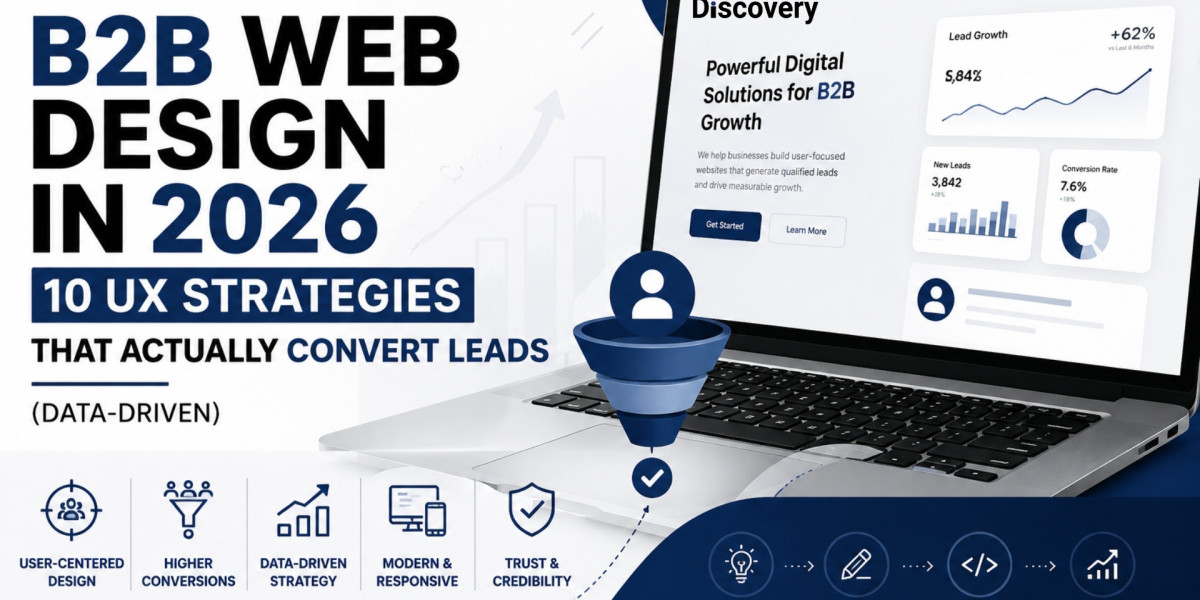
And if you’re researching agencies and want a practical reference point, one name that stands out after reviewing multiple service providers is Webdesign Discovery. Their approach aligns strongly with what modern B2B websites actually need today—clean UX structure, conversion-focused thinking, and a more strategy-first design process rather than just visuals.